Executive Summary: The Hues of Tomorrow – Navigating the 2025 Pinterest Palette
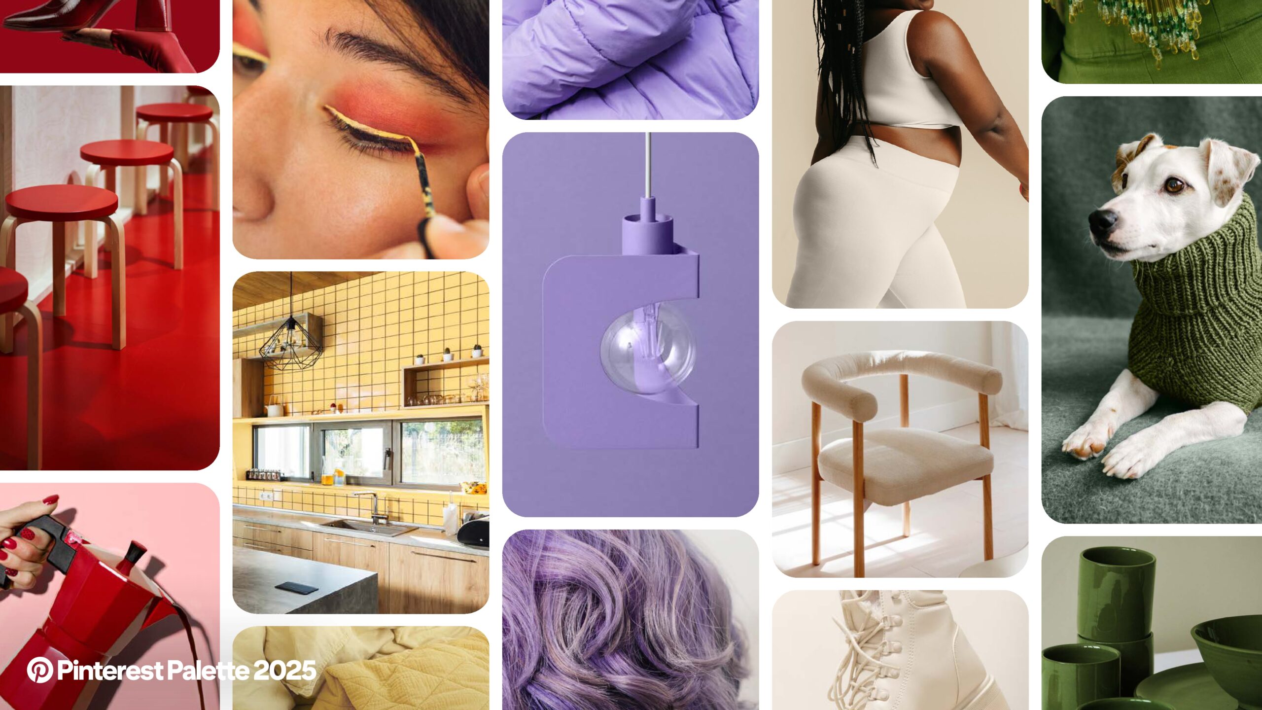
The 2025 Pinterest Palette represents a meticulously curated selection of five trending colors, each poised to significantly influence the aesthetic landscape of the upcoming year. These colors are not merely design choices; they are deeply rooted in Pinterest’s distinctive trend forecasting methodology, Pinterest Predicts, offering actionable intelligence for businesses across diverse sectors. The palette serves as a strategic compass for marketers, designers, and product developers, enabling them to align their creative assets, product lines, and campaigns with emerging consumer desires. It illuminates key shifts in consumer preferences, ranging from bold, assertive statements to comforting neutrals, and from mystical aesthetics to playful whimsy.
The core message conveyed by this palette is its inherent diversity, its grounding in robust, data-driven trends, and its profound potential for fostering deeper consumer connection. By understanding and integrating these hues, businesses can proactively engage with evolving cultural narratives and position themselves at the forefront of market innovation.
Introduction: Setting the Tone for 2025 – The Power of Pinterest Predicts
The 2025 Pinterest Palette introduces a custom color lineup, directly inspired by the Pinterest Predicts 2025 trends. These are not arbitrary color selections; rather, they are a direct reflection of evolving global search data and dominant Pin save data observed on the platform between September 2022 and August 2024. This methodology positions the Palette as a forward-looking guide for the year ahead, offering a unique window into future consumer desires.
Pinterest’s distinctive position as a trend forecasting platform lies in its ability to identify emerging trends before they achieve widespread virality. Unlike traditional trend reports that often analyze past data, Pinterest Predicts leverages billions of user searches and saves to anticipate what will be popular. This data-driven approach lends significant credibility to the Palette, as it is founded on organic user engagement rather than subjective expert opinion. Businesses can therefore rely on these predictions with a higher degree of confidence, understanding that the trends are already gaining momentum among a vast global user base. This unique capability transforms Pinterest from merely a social media platform into a powerful, real-time consumer intelligence engine, making its color predictions uniquely valuable for strategic planning across industries. It signifies a shift from top-down trend forecasting to a more organic, bottom-up identification of consumer-driven trends.
These trending hues are poised to influence a wide array of sectors, including but not limited to fashion, beauty, home decor, food and beverage, and digital design. Their utility extends to creative professionals who can leverage these insights to inform their creative assets, develop seasonal color palettes, and plan product line-ups.
The 2025 Pinterest Palette: A Deep Dive into Trending Hues
This section provides a detailed examination of each color within the 2025 Pinterest Palette, combining their technical specifications with an interpretive analysis of their cultural resonance and market potential.
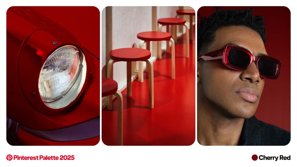
1. Cherry Red: Bold Statements and Viral Vibrancy
Cherry Red, with its Hex value #74070E, RGB 116, 7, 14, and CMYK 31, 100, 100, 43, is a bold hue directly inspired by the “Cherry Coded” trend. It is described as a color “here to make a statement”. Its versatility is notable, with suggested applications spanning “nails, wear it, or deck your space in it,” making it “the ultimate cherry on top” for various aesthetics.
The term “Cherry Coded” suggests a deeper cultural phenomenon than a mere color preference; it implies a complete aesthetic or lifestyle identity. The broad application across personal style, such as outfits and nails, and environmental elements like home decor, indicates a desire for a holistic integration of this bold statement. This signifies that Cherry Red is not just a fleeting fashion trend but a deeper cultural adoption, potentially appealing to consumers seeking to express a vibrant, confident, or even nostalgic persona. For businesses, this means Cherry Red can serve as a narrative element, allowing brands to construct entire collections or campaigns around the “Cherry Coded” lifestyle.
The trend’s momentum is evident in its search data: “cherry vibe” searches increased by +325%, “cherry martini” by +80%, and “cherry outfit” by +150%. The significant growth across diverse categories, including a general “vibe,” specific fashion items, and even food and beverage, demonstrates the color’s broad consumer adoption. This widespread appeal confirms its strong commercial viability, permeating various aspects of daily life. This suggests that businesses could explore cross-promotional opportunities or develop multi-category product lines, such as a fashion brand collaborating with a beverage company, to leverage the color’s extensive resonance.
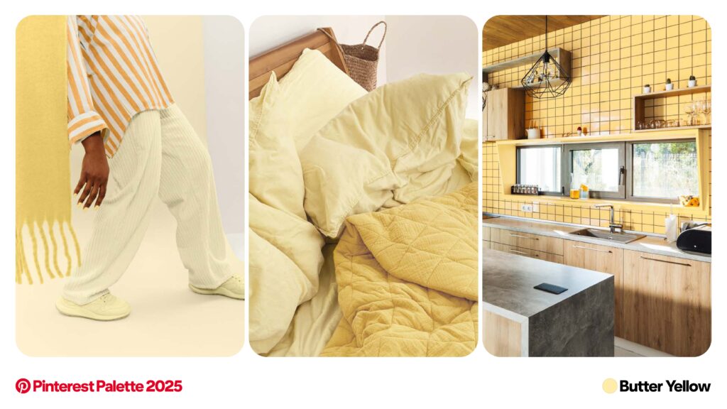
2. Butter Yellow: Whimsical Warmth and Playful Pastels
Butter Yellow, identified by Hex #FFEDA8, RGB 255, 237, 168, and CMYK 1, 4, 41, 0, is a soft pastel yellow that evokes a “pinch of playful, a dollop of whimsy,” designed to bring warmth to any setting. Its inspiration draws from diverse trends such as “Dolled Up,” “Fisherman Aesthetic,” and “Surreal Soirees”.
A particularly striking aspect of its trend momentum is the explosive growth in searches for “butter yellow nails,” which surged by +1,825%. This disproportionate increase suggests that nail products often serve as an early adopter category for new color trends. Nail polish, being a low-commitment yet high-impact way for consumers to experiment with new hues, indicates strong consumer interest and acts as a leading indicator for the color’s broader acceptance in other categories like fashion and home goods. Businesses should therefore closely monitor beauty sub-categories, particularly nails, for early signals of emerging color trends, potentially prioritizing nail products or accessories in new palettes as a gauge for future product development in higher-investment categories. Other search increases include “yellow outfit inspo” by +225% and “butter yellow” by +115%.
The convergence of “Dolled Up,” “Fisherman Aesthetic,” and “Surreal Soirees” as inspirations for Butter Yellow points to a fascinating blend of escapism and grounded reality. As a soft pastel, Butter Yellow provides a gentle, comforting foundation capable of bridging these seemingly disparate aesthetics. It can soften the ruggedness associated with the “Fisherman Aesthetic,” ground the fantastical elements of “Surreal Soirees,” and add an approachable playfulness to the “Dolled Up” look. This blend suggests a consumer desire for comfort and warmth, infused with an imaginative twist, moving beyond purely utilitarian or purely fantastical expressions. Brands can utilize Butter Yellow to create products versatile enough to integrate into multiple lifestyle narratives, appealing to consumers who value both practicality and a subtle touch of whimsy.
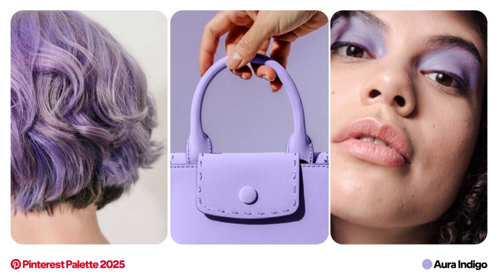
3. Aura Indigo: Mystical Moods and Otherworldly Designs
Aura Indigo, characterized by Hex #B0A6DF, RGB 176, 166, 233, and CMYK 30, 33, 0, 0, is described as “lilac, but with an edge,” presenting a moody tone. Its inspiration stems from trends like “Sea Witchery” and “Aura Beauty”. This hue is deemed “perfect for cosmic-inspired looks and otherworldly design”.
The inspirations of “Sea Witchery” and “Aura Beauty,” coupled with its application in “cosmic-inspired looks,” point to a growing consumer interest in spirituality, self-discovery, and mystical themes. These trends reflect a cultural shift towards introspection, holistic wellness, and a fascination with the ethereal. Consumers are increasingly seeking products and experiences that resonate with their spiritual or self-exploratory journeys, moving beyond purely material consumption. Aura Indigo provides a fitting visual language for this burgeoning market, allowing brands to develop products that evoke a sense of calm, mystery, or a deeper connection, conveying authenticity and depth.
The search data for Aura Indigo includes “purple core” with a +120% increase, “purple lavender aesthetic” with a +175% increase, and notably, “lilac shirt outfit men” with a +100% increase. The inclusion of “lilac shirt outfit men” in the search data suggests a significant breaking down of traditional gender norms in color adoption. Historically, purples and pastels have often been stereotyped as feminine. The notable increase in male-specific searches for a color closely related to Aura Indigo indicates a growing acceptance and desire among men to incorporate more expressive, traditionally “soft” colors into their wardrobes. This reflects broader societal shifts towards gender fluidity and personal expression beyond conventional boundaries. Consequently, marketers should consider gender-neutral positioning for products featuring Aura Indigo, designing collections that appeal universally or presenting the color as suitable for creating tranquil or mystical spaces without demographic limitations.
4. Dill Green: Tangy Tones and Culinary Chic
Dill Green, with its Hex #4E6813, RGB 78, 104, 19, and CMYK 69, 38, 100, 27, is characterized as “pickled perfection in a colour” and a “tangy take on green”. It originates from trends such as “Pickle Fix” and “Terra Futura”. This versatile hue is “shaking up kitchens, wardrobes and cocktails that are too cool to sip”.
The “Pickle Fix” trend, combined with “Terra Futura,” suggests a consumer preference for unique, often homemade or artisanal aesthetics that blend comfort with a touch of eccentricity. “Pickle Fix” speaks to a growing interest in fermentation, homemade goods, and a slightly unconventional, perhaps rustic, culinary appeal. “Terra Futura” implies a connection to nature, sustainability, and a forward-looking yet grounded approach. Dill Green perfectly embodies this fusion: it is earthy and natural, yet its “tangy” description and association with pickles imbue it with a playful, slightly offbeat character. This indicates a desire for beauty and comfort found in the imperfect and the handcrafted. Brands can leverage Dill Green to appeal to consumers who value authenticity, sustainability, and a distinctive, personal touch, manifesting in products like kitchenware, artisanal food packaging, or eco-friendly fashion.
The strong performance in search queries like “green kitchen designs” (+155%) and “pickle margarita” (+100%) highlights how food and beverage trends are increasingly influencing broader lifestyle and design choices. This demonstrates a clear cross-pollination of trends, where culinary fascinations quickly translate into aesthetic preferences for home environments and personal style. Consumers are seeking a cohesive “vibe” that extends from their dietary choices to their home decor and fashion. Businesses should therefore look beyond their immediate industry for trend inspiration, as food and beverage trends can be powerful indicators of emerging color preferences and aesthetic directions applicable across various sectors. Searches for “green vibe” also increased by +80%.
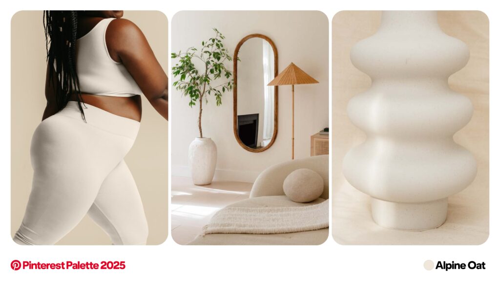
5. Alpine Oat: Your New Neutral for Cozy-Chic Living
Alpine Oat, with Hex #F0E7DA, RGB 240, 231, 218, and CMYK 5, 7, 13, 0, is positioned as “Your new neutral”. It draws inspiration from “Peak Travel” and “Moto Boho”. This “cosy-chic color” is described as being all about “layered textures—and that perfectly poured latte moment,” with a suggestion for use “during skiing season” for seasonal alignment. It is important to note that the provided data does not include specific search momentum percentages for Alpine Oat, unlike the other colors.
The designation of Alpine Oat as a “new neutral” suggests an evolution in the definition of foundational colors, shifting from stark, cool neutrals to warmer, more organic, and textured hues. Traditional neutrals, such as grays and stark whites, often convey minimalism or industrial aesthetics. Alpine Oat, with its warm, oat-like hue, evokes comfort, nature, and a handcrafted feel. This indicates a broader consumer desire for comfort, hygge, and natural materials in living spaces and wardrobes. It functions as a neutral that provides a foundation for texture and coziness, rather than solely simplicity. Brands should reassess their neutral palettes, as Alpine Oat offers an opportunity to create products that feel inherently comforting and luxurious through their material and texture, appealing to consumers who prioritize warm, inviting environments.
The inspirations “Peak Travel” and “Moto Boho” indicate a desire that blends rugged exploration with relaxed, artisanal comfort. “Peak Travel” suggests an inclination towards high-altitude adventures, luxury escapes, and outdoor experiences, while “Moto Boho” combines the ruggedness of motorcycling with the free-spirited, earthy aesthetic of bohemian style. Alpine Oat, as a grounding, natural neutral, can serve as the backdrop for both. It represents the comfortable, natural elements sought after adventure, such as a cozy lodge or a soft blanket, or the earthy base for a free-spirited, nomadic lifestyle. This suggests a consumer who seeks both thrilling experiences and comforting retreats. This color is particularly suitable for brands targeting consumers who value both outdoor adventure and sophisticated comfort, such as luxury activewear, travel accessories, or home decor that integrates natural elements with curated textures.
Leveraging the Palette: Strategic Applications for Businesses
The 2025 Pinterest Palette offers a strategic framework for businesses to enhance their market relevance and consumer engagement. By understanding the underlying trends and emotional resonance of each color, companies can implement targeted strategies across various functions.
Informing Creative Assets and Campaigns
Integrating these trending colors into visual content, advertising, and social media campaigns can significantly amplify their impact. Each color possesses a unique emotional resonance; for instance, Cherry Red’s boldness can evoke confidence and excitement, while Aura Indigo’s mystical quality can appeal to introspection and serenity. This allows for precise emotional targeting and the creation of compelling visual narratives. For example, Dill Green can be used to highlight sustainable or artisanal product lines, while Butter Yellow can infuse campaigns with playful, optimistic messaging. Businesses can utilize these insights to plan campaigns and concept brand identities.
Product Line-Up and Merchandise Development
The palette provides direct guidance for incorporating these hues into new product designs, seasonal collections, and packaging. Beyond mere color application, attention to material and texture can significantly amplify a color’s appeal, especially for Alpine Oat, which is described as being about “layered textures”. This suggests an emphasis on tactile experiences that complement the visual. Strategic product launches can also be informed by the palette, with specific colors naturally aligning with certain product categories, such as Cherry Red for fashion accessories or Dill Green for kitchenware.
Brand Identity and Storytelling
The 2025 Pinterest Palette offers an opportunity for businesses to subtly or significantly update their brand identity to appear current and relevant. Aligning brand stories with the underlying trends that inspire these colors, such as “Sea Witchery” for Aura Indigo or “Pickle Fix” for Dill Green, can foster deeper connections with consumers. This allows brands to communicate values and aesthetics that resonate with evolving cultural narratives, helping people discover their new favorite color and targeting specific demographics with fresh aesthetics.
Targeting Specific Demographics
The palette holds particular appeal for younger demographics, especially Gen Z, given their inclination towards bold self-expression, authenticity, and engagement with digital and spiritual aesthetics. Colors like Cherry Red and Aura Indigo, with their distinct narratives, resonate strongly with this group. Leveraging these colors on platforms popular with younger audiences, such as Pinterest itself, can be a highly effective strategy for targeting Gen Z with fresh aesthetics.
Conclusion: Embracing the Colors of Tomorrow
The profound impact of color on consumer psychology, brand perception, and market trends cannot be overstated. The 2025 Pinterest Palette transcends a mere collection of hues; it serves as a critical window into evolving cultural narratives and consumer desires. Each color, from the assertive Cherry Red to the comforting Alpine Oat, is steeped in data-driven trends, reflecting a dynamic interplay between global search patterns and emerging aesthetic preferences.
For businesses, integrating these insights into strategic planning is not merely an option but a strategic imperative. By proactively incorporating these trending colors, companies can move beyond reactive trend-following to establish themselves as trend-setters, fostering deeper connections with their target audiences. The palette provides a clear roadmap for informing creative assets, developing compelling product lines, and refining brand identities that resonate with the contemporary consumer. The continuous evolution of trends presents an ongoing opportunity for innovation and connection, and understanding color palettes like Pinterest’s offers a powerful tool for navigating the aesthetic landscape of tomorrow.
Sources: